Advanced Character Design with Stephen Silver, Part 3
The third lesson in Stephen Silver’s Advanced Character Design course was all about caricaturing. Stephen stressed how strengthening your caricature skills can help you design more interesting characters. So our assignment was to take a celebrity and caricature them.
I kinda cheated on this one and turned in two. I started with Josh Gad, but he felt too easy. His features are pretty easy to caricature. He was fun to draw, but what’s the point of taking a class with Stephen Silver if all I’m going to do is turn in work I know is a homerun? I'm in this to push myslef! Here’s my Josh Gad sketches. He’s a fun guy to draw:

After that, my wife suggested I try Jon Stewart (after hearing me lament the end of his Daily Show run all week). I’ve been watching The Daily Show for years, so I felt like I understood the “feel” I needed to hit. That’s something Stephen pointed out in the lesson, by the way. If you can see the subject you’re caricaturing in action, you can pick up quirks that can inform your drawing. If the likeness isn't spot on, but the "feel" is, you're good to go.
Turns out Jon Stewart was pretty hard to nail. I spent a couple sessions just watching his show and sketching him, trying to pick out the features that made him Jon Stewart. Then I sat down with a ton of still images and started narrowing it down. Here are the sketches I posted on Instagram.

And here’s the final image:

I included my sketches when I turned in my work so Stephen could see how I got to my final picture. Here’s the feedback from Stephen:
I’m not going to lie, it feels kind of awesome when someone like Stephen Silver says you did a great job. I think he definitely helped refine it a bit more. I struggled a bit on the final image with the age. When I first finished it, Brooke said it looked like Jon Stewart from 2005, not 2015. So I kinda went in there and sagged a few things down. It sorta worked, but I think Stephen’s tweak to the nose is what really sells it.
That’s it for week three. Lesson four was all about drawing women. Our assignment was to draw one waitress with three body types. I’ll have that feedback up next week along with a bunch of practice images.
Advanced Character Design with Stephen Silver, Part 2
The assignment this week was to draw a character to fit into a show of our choice. Stephen said art directors want to see that you can conform to a show’s style. So this assignment would be good practice.
During the lesson, Stephen showed off the styles of several shows he worked on, as well as some character development concepts he’d done in the past. At one point he pulled up a random picture of a 1920s business guy and drew him in the Kim Possible style. Then he redrew that same guy in the Danny Phantom style. Watching him just flip between the two styles was kind of amazing, plus it served as a great example of how some very small established rules can ripple out to create a cohesive style.
As an animation fan, and a father of two small boys, I’ve seen a lot of cartoons. I ran through several that I thought about trying—Gravity Falls, Rescue Bots, Kung Fu Panda. Before committing to one for the assignment, I decided to try a style out for fun. I went with Fairly Odd Parents, a show that I’ve always thought had a really clear style, and drew this picture of Taako from The Adventure Zone podcast.
That was a fun exercise, but I wanted more of a challenge. While that picture doesn’t fit perfectly in the style of Fairly Odd Parents, it’s pretty close. One more iteration and I’d get it I think. I wanted to take on something a little tougher. Something with rules that were a little harder to define.
So I went with the Mickey Mouse shorts on YouTube. My oldest son and I watch at least one of these a day. I love them. They’re so weird, and charming, and the way they stretch and pull such classic characters in crazy ways is fun to watch. Also, the backgrounds are gorgeous.
Before working on my characters, I did some research. Most episodes have at least one or two random side characters with unique designs, so I pulled screenshots of several of them. Like Stephen did in his lesson, I started tracing over some of them to try and break down the style.

Research
It was hard.
Unlike the straight against curve design of Fairly Odd Parents, there wasn’t an easy baseline theme that all the characters adhered to. And yet there was definitely something, because they all fit.
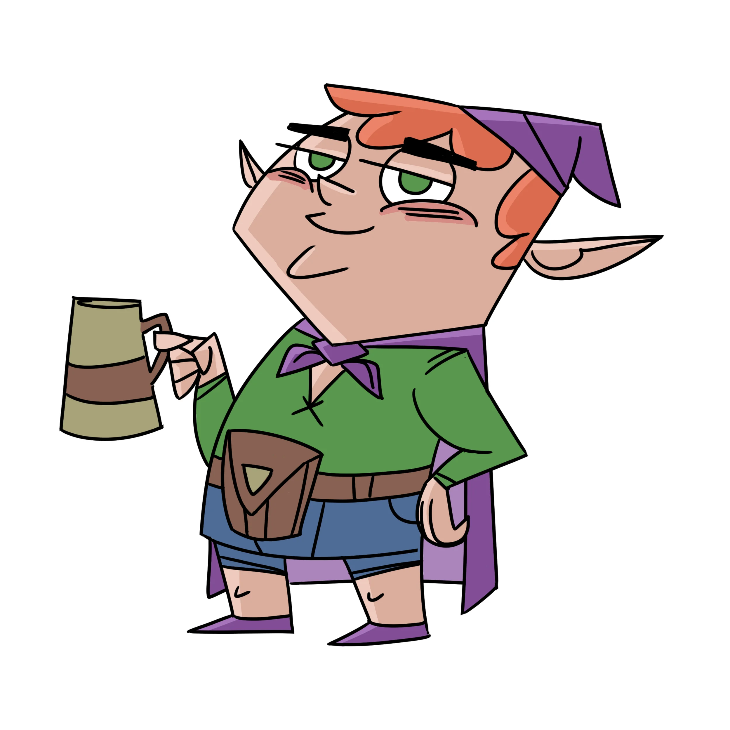
So I designed three characters: a boxing kangaroo, a landlord bulldog, and a traveling lama.

I was as eager to hear Stephen’s feedback as I was to see him break down the style too. I was not disappointed. Here’s the feedback:
See what he did with that kangaroo? Amazing right? It’s clear he’s been doing this kind of work for a long time. When I drew these, I was focused inward. I drew the general shape of the character and filled it with detail—because from my research, they all had really clear silhouettes, and I wanted to maintain that. But Stephen pushed outward, and his ended up fitting the wacky (a great word for this style) tone even better.
After watching his feedback, I went back and re-watched a few Mickey shorts and could already see how his interpretation of the style would work. I’m definitely going to try to do some more. It’s a good skill to have, and seeing him so easily break a style down and produce something that would fit made me want to polish my skills so I can do that too someday.
That’s it for this week. Our next assignment is to caricature someone, because being good at caricatures can actually be super helpful when designing characters. I’ll have that feedback next week!
Bioshocked [UPDATE: More Posters!]
I finished Bioshock Infinite the other day and it's still rattling around in my head. Because I can't stop thinking about the game, I made some posters. I'm wondering if I can make them cryptic enough to not spoil anything.


