Advanced Character Design with Stephen Silver, Part 8
It's a new year!
I'll be posting here more frequently in 2016. I've got a new position at work and some exciting developments in some personal projects and I'll be sharing all that stuff soon. For now, my final post about Stephen's class.
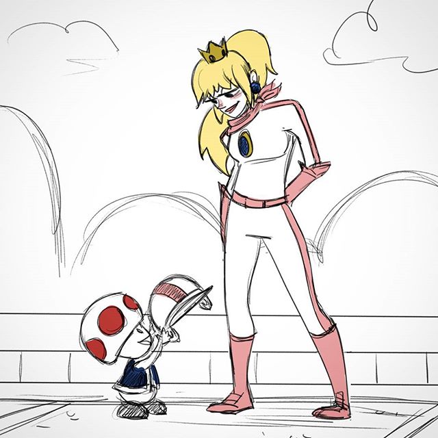
The class has been over for months, but I figured I should share my last project. We had to design a set of characters based on traits—shy, athletic, bully, smart. Two boys, two girls.
I decided to try to fit these teens into the short-lived Spectacular Spider-Man show's style. I loved the art style and character design of that show (hat tip to Sean Galloway). It’s a style I’ve always admired, but never tried myself. If you haven't seen it, the show had super thin lines and flat colors, but everything looked really smooth and dynamic.
Here’s what I ended up with:

I think I was mostly successful.
Unfortunately, I don’t have the feedback video for this one. I forgot to download it before the class closed. But his feedback was in line with a lot of the other things he said during the course. He pushed some of the forms a bit so they could better lean into their traits—a stronger inward hunch for the shy kid, a sassier tilt for the mean girl bully, etc.
The biggest thing I learned in this course (and this assignment was a good example of how I still struggle with it) is how to keep the energy and excitement of a sketch in the final image. Sketches are loose, kinetic, exciting. They're alive with possibility. When you start putting lines down, you tame that wildness. Tame it too much, and your drawing looks stiff and lifeless. It's not an easy thing to do, but I'm more aware of when it happens now than I ever was before.
I went to CTNX for the first time this year and got to meet a lot of art friends I know online in person, and that includes Stephen. I got to do some live drawing at his art studio with a bunch of my Oatley Academy friends. It was so cool!
Stephen has a bazillion students, both online and in person, but he remembered my art and, as I knew he would be, was super nice and friendly. He's an all around good dude, and I'm so glad I got to learn from him.
So if you're thinking about brushing up on your character design, I cannot recommend his class enough. It might be worth it alone just to watch him draw each week. Seeing character design the way he sees it has helped me be more thoughtful about the characters I create.
Advanced Character Design with Stephen Silver, Part 4
This assignment was about drawing women—something I’ve definitely struggled with. What I love most about this class is how many different styles Stephen exposes you to in each lesson. He pulled up tons of different images and styles and highlighted the similarities and core principles many of them used to design women.
Another thing I like about this class is how much he stresses putting in the work through repetition. Lots of people talk about it, but you rarely get to see that constant repetition in action (because unless you’re super into art, it’s not that glamorous). This lesson was filled with Stephen talking over sped up sketches. Faces, bodies, different styles, and more—he just kept drawing. It was fascinating and inspiring.
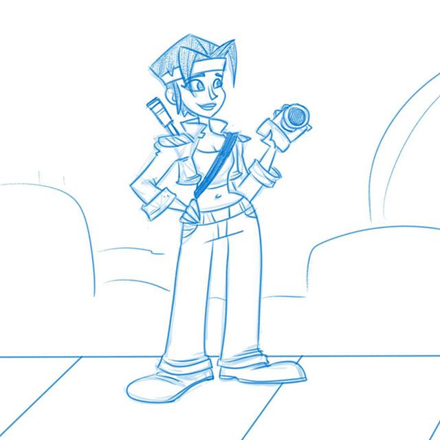
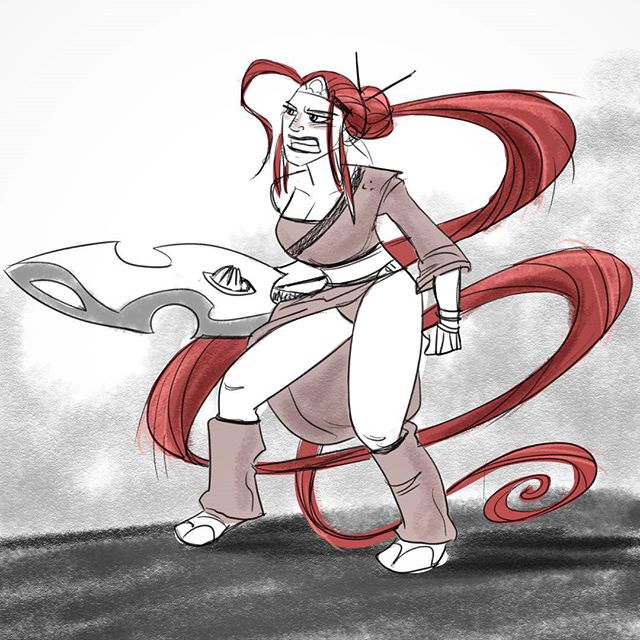
So before I took on my assignment—draw three waitresses with three different body shapes—I decided to just draw a bunch of women from reference.
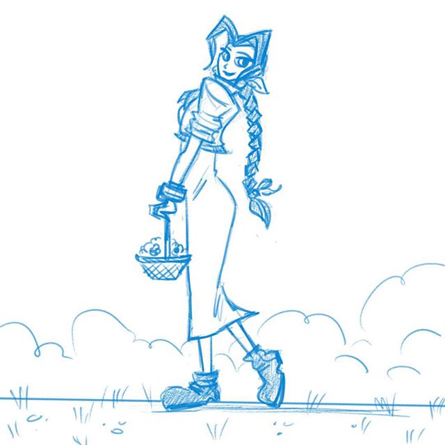
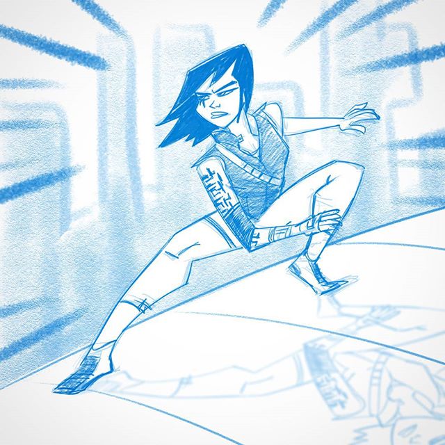
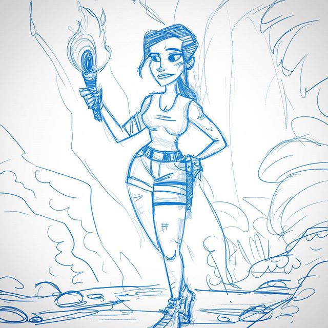
I searched random stock photos and Google image results and went with poses that looked interesting. Then I dressed those women up as video game characters, because I like video games.
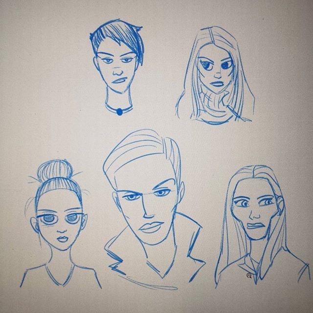
I also practiced a few faces.
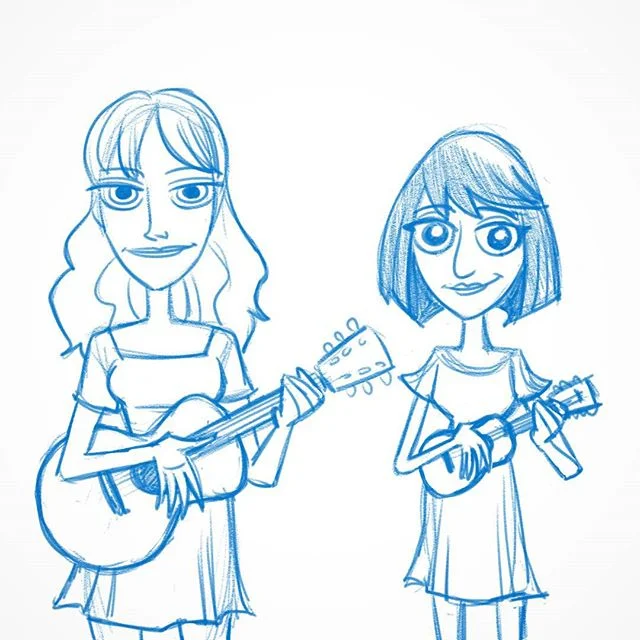
And then I brought in what I learned from the caricature lesson from the week before and sketched Garfunkel & Oates while I watched their hilarious show on Netflix.
All that sketching done, I felt ready to take on the assignment. Here’s what I turned in:

And here's the feedback:
Not bad! I’m getting better and better at avoiding tangents. Each time he catches one I commit it to memory to avoid in the future. It seems so simple, but cutting out those tangents makes an enormous difference when designing characters. Avoiding tangents and varying shapes is something Stephen seems to do easily--I want that! I can feel myself getting better at it the more I do it.
Heh, this just in: drawing a lot can help you draw better.
Embracing imperfection
“I find it funny that digital art’s greatest advantage is also its greatest weakness (for me, at least.) In digital medium, the biggest problem and boon is that perfection is possible. Not easy, but possible.
And that drives me nuts.
Because I keep trying for it even when I tell myself not to.
But not so with traditional medium. For some reason, the nature of traditional media makes me expect imperfection and, in fact, makes it more beautiful and interesting.
I guess this is a long way of saying I got some brushes for Manga Studio so I can have the best of both worlds.”
Saw this post at FRENDEN.com. Couldn't have said it better myself. My passion for drawing has only increased since I started working with actual pencil, paper and ink more frequently. It's taught me to embrace the imperfections, improvise better, and has forced me to iron out and/or confront some weaknesses. Frenden's Manga Studio brushes do the same--just gotta make sure I don't lean too heavily on that Undo button.