Making the cover of Movie Title Typos
“You want to take a crack at the cover?”
That’s what my editor, Steve Mockus, said back in early January. I hadn’t brought up the cover of my book for two reasons:
1. I was busy working like crazy to get the interior of the book done and hadn't thought about any cover ideas.
2. I wasn’t sure they’d want me to do the cover even if I had some ideas—they know more about what makes a good book cover than I do. If they decided to have someone else do it, I probably wouldn’t have protested.
That being said, I was more than happy to give it a shot. Steve, Neil Egan—the super talented Chronicle Books designer who worked on my book—and I all agreed that the cover should incorporate movie posters.
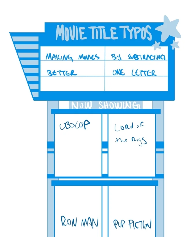
Steve sent me this sketch for a general direction, along with this note:
Do not judge me I AM NOT A GRAPHIC DESIGNER.

I took that general direction and fleshed it out a bit. I used images I’d already finished, added some logo and type treatment to turn them into posters, and slapped together a very rough cover.
I also sent them a couple of images for inspiration. It was important that the cover be attractive, but also tell the story of what you’ll find inside, I thought all three of these would do that.


They liked the first one the most. They thought versions 2 and 3 were overly complex—you need to get the idea of the book immediately. I agreed (which I generally did for most things, because again, this is what they do for a living). So we were going to drill down into the first one. Neil sent me a document about cover dimensions and some picture inspiration for the marquee.


That weekend I headed down to Cancun for my company’s annual tropical trip/ridiculous company meeting. I checked into my hotel room, unpacked my Cintiq Companion and got to work. Side note: while some might feel it was a bummer that I spent most of my weekend in my room working while my coworkers were boozing it up on the company dime, I actually really enjoyed myself. The room service was free, the wi-fi was good, and this was my view.
Anyway, I worked on the cover all weekend, then sent what I had to Neil and Steve. This is what they were going to show others at Chronicle to get the concept approved.

Neil sent it back with some notes and cleaned up my sad typography. There were areas he thought I could push more, and we were still not sure which movies to feature.

It was getting there, but something felt off.
The biggest issue with the cover at this point was that it didn’t tell a story or offer a sense of place. That would be fine if it wasn’t implying one. There was a marquee, there were posters and lights, but they were all kind of just floating there. Parts of a scene, not a real scene.
I didn’t know that of course. I felt like something was off, but it wasn’t until Neil told me that on a phone call a few days later that it clicked. He sent me some more marquee images he found and encouraged me to try out a few more concepts.
So I went back to the drawing board. This time I had a better idea of what I needed to communicate. I needed a scene, and I needed to highlight at least two movie posters. I spent a long time looking at images of every type of movie theater I could think of—from classic inner-city establishments to drive-ins. I came up with several concepts and sent them to Neil and Steve.


They liked the second one the most, and so did I. Oddly enough, the inspiration for that one didn’t come from a google image search of marquees, but from Marvel’s Agent Carter. Because I was working around the clock on this book I often streamed movies and shows on another screen to help me stay awake. The night I was working on these mock-ups I was checking out Marvel’s Agent Carter on Hulu. In the first or second episode she visits a club and I happened to look up from my Cintiq at just the right time.

Sadly I can't find the picture of the club. Oh well. You never know where inspiration will come from.
I paused the screen and sketched a movie theater around that idea. Here’s what Neil had to say about this version:
What I like about this option is that it really feels more resolved and believable as a space, with just a few adjustments. When we pull out just a little bit, we can see the top of the marquee, and the sidewalk below. And the centrally placed ticket window is the perfect way to make it feel believable as the front of the theater, without having to use a bunch of space to draw boring doors. And the revised marquee with more dimension is really nice too!
Neil sent the sketch back with some notes and I got to work on the next iteration.

I decided to send Neil my line work before coloring so I could make sure I was on track. I sent him a refined version of the sketch, and he sent back more notes. Also, somewhere along the line we decided the movies featured on the cover should be Obocop and Lord of the Rigs.

From there I made some more adjustments, colored the image, and sent it back again. Unlike the initial cover I did in Mexico, I went with cool tones on this one. I liked the dark blues and grays better. That was one of those “why didn’t I do this the first time” kind of decisions. We were getting really close.
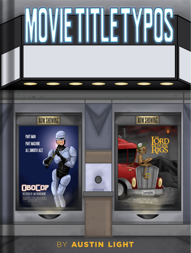
Neil added in the subtitle and underline under the marquee and also swapped the color of the marquee letters to orange. That really made the title pop against the cool tones (and possibly unintentionally, gave my book about movies some blue and orange contrast action—the universal movie poster colors).
And that’s it! There were some very slight adjustments to contrast to make the title stand out a little more, and when printed, the movie posters were given a cool reflective sheen, which you can sort of see in the image below.
The whole thing came together in a month and a half. It was a collaborative effort, and it was really fun to have Steve and Neil there to help me iterate.
As for the back cover, that came together much faster. Neil thought it would be cool to replicate the movie section in a newspaper. It would allow us to put some words on the back and feature a few more posters. He and Steve sent me the idea and some inspiration images.


I sent a version back, Neil did some refinement, and it was done—much faster than the front cover. Here’s the final result:

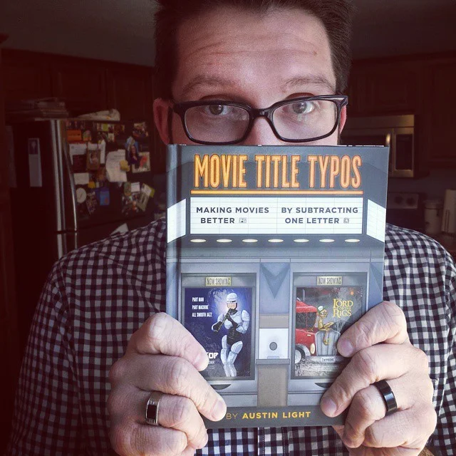
It’s still hard for me to wrap my mind around at times. I have a book, and it has a cover drawn by me! With Steve and Neil’s help I was able to make something that communicates what the book is about, shows off my art style, and also looks very pick-upable.
So, after September 22, when you see it in a store, pick it up! I’m really proud of it. Also, there’s funny stuff inside.